Are there differences in car crash rates by county?#
import numpy as np
import pandas as pd
import json
import plotly.graph_objects as go
import matplotlib.pyplot as plt
import seaborn as sns
def plot_choroplethmap(counties, fips, value, value_min, value_max, text, title):
    fig = go.Figure(go.Choroplethmapbox(geojson=counties, locations=fips, z=value,
                                    colorscale="Viridis", zmin=value_min, zmax = value_max,
                                    marker_opacity=0.8, marker_line_width=1,
                                    text=text))

    fig.update_layout(mapbox_style="carto-positron",
                      mapbox_zoom=4.3, mapbox_center = {"lat": 37.5, "lon": -120})
    fig.update_layout(margin={"r":150,"t":30,"l":150,"b":0},
                      title={"text":title})
    fig.show()
# relative path to data & figures directory
from paths import DATA_PATH, FIGURES_PATH
# Organizing the dataset and abtract features we want
county_data_2019 = pd.read_excel(f"{DATA_PATH}/location_2019.xlsm", header=2, sheet_name="Table 8A - Crashes")
county_data_2019 = county_data_2019[county_data_2019["County"].notna()].reset_index()
county_data_2019["Total Crashes"] = county_data_2019.iloc[:, 4:7].sum(axis=1)
county_data_2019 = county_data_2019.iloc[:, [1, 7, 8, 15]].drop(58)

fatality_df = pd.read_excel(f"{DATA_PATH}/location_2019.xlsm", header=3, sheet_name="Table 8I").drop(58)
county_data_2019["Total Fatal"] = fatality_df["Total"]

injury_df = pd.read_excel(f"{DATA_PATH}/location_2019.xlsm", header=3, sheet_name="Table 8K").drop(58)
county_data_2019["Total Injury"] = injury_df["Total"]

alcohol_df = pd.read_excel(f"{DATA_PATH}/location_2019.xlsm", header=4, sheet_name="Table 8L")
county_data_2019["Alcohol Involved Crashes"] = alcohol_df.fillna(0).iloc[0:58:, [9, 10]].sum(axis=1).astype(int)

population_df = pd.read_excel(f"{DATA_PATH}/location_2019.xlsm", header=4, sheet_name="Table 8B").iloc[0:58, 4].astype(int)
county_data_2019["Population"] = population_df
# Display the first 10 rows of the dataset
county_data_2019.head(10)
| County | Alcohol Involved Fatal | Alcohol Involved Injury | Total Crashes | Total Fatal | Total Injury | Alcohol Involved Crashes | Population | |
|---|---|---|---|---|---|---|---|---|
| 0 | Alameda | 28 | 655 | 22768 | 96 | 10441 | 469 | 1668965 |
| 1 | Alpine | 0 | 4 | 77 | 2 | 66 | 1 | 1123 |
| 2 | Amador | 4 | 38 | 521 | 16 | 276 | 29 | 37724 |
| 3 | Butte | 9 | 143 | 2226 | 34 | 1262 | 130 | 214532 |
| 4 | Calaveras | 4 | 45 | 598 | 11 | 305 | 44 | 44403 |
| 5 | Colusa | 1 | 21 | 352 | 12 | 205 | 22 | 22045 |
| 6 | Contra Costa | 27 | 492 | 12195 | 77 | 5982 | 383 | 1147269 |
| 7 | Del Norte | 1 | 19 | 285 | 11 | 217 | 20 | 27207 |
| 8 | El Dorado | 11 | 103 | 1644 | 29 | 861 | 96 | 188818 |
| 9 | Fresno | 34 | 305 | 7848 | 135 | 4247 | 297 | 1018437 |
# Load the fips code of each county in California
county_fips = pd.read_excel(f"{DATA_PATH}/county_fips.xlsx")
county_fips.head(10)
| county | fips | |
|---|---|---|
| 0 | Alameda | 1 |
| 1 | Alpine | 3 |
| 2 | Amador | 5 |
| 3 | Butte | 7 |
| 4 | Calaveras | 9 |
| 5 | Colusa | 11 |
| 6 | Contra Costa | 13 |
| 7 | Del Norte | 15 |
| 8 | El Dorado | 17 |
| 9 | Fresno | 19 |
# Combine the county fips with the California State fips to create the full fips
cal_fip = "06"
def create_full_fip(county_fip, state_fip):
    if len(county_fip) > 3:
        raise("Invalid county_fip")
    while len(county_fip) < 3:
        county_fip = "0" + county_fip

    return state_fip + county_fip

county_fips["fips"] = county_fips["fips"].astype(str)
county_fips["fips"] = county_fips["fips"].apply(lambda fips: create_full_fip(fips, cal_fip))
county_fips = county_fips.rename(columns={"county":"County"})
county_fips.head()
| County | fips | |
|---|---|---|
| 0 | Alameda | 06001 |
| 1 | Alpine | 06003 |
| 2 | Amador | 06005 |
| 3 | Butte | 06007 |
| 4 | Calaveras | 06009 |
# Organize the dataset again by rearanging column order
county_data_2019 = pd.merge(county_fips, county_data_2019, on="County")
county_data_2019 = county_data_2019.iloc[:, [0, 1, 8, 4, 5, 6, 7, 2, 3]]
county_data_2019.head(10)
| County | fips | Population | Total Crashes | Total Fatal | Total Injury | Alcohol Involved Crashes | Alcohol Involved Fatal | Alcohol Involved Injury | |
|---|---|---|---|---|---|---|---|---|---|
| 0 | Alameda | 06001 | 1668965 | 22768 | 96 | 10441 | 469 | 28 | 655 |
| 1 | Alpine | 06003 | 1123 | 77 | 2 | 66 | 1 | 0 | 4 |
| 2 | Amador | 06005 | 37724 | 521 | 16 | 276 | 29 | 4 | 38 |
| 3 | Butte | 06007 | 214532 | 2226 | 34 | 1262 | 130 | 9 | 143 |
| 4 | Calaveras | 06009 | 44403 | 598 | 11 | 305 | 44 | 4 | 45 |
| 5 | Colusa | 06011 | 22045 | 352 | 12 | 205 | 22 | 1 | 21 |
| 6 | Contra Costa | 06013 | 1147269 | 12195 | 77 | 5982 | 383 | 27 | 492 |
| 7 | Del Norte | 06015 | 27207 | 285 | 11 | 217 | 20 | 1 | 19 |
| 8 | El Dorado | 06017 | 188818 | 1644 | 29 | 861 | 96 | 11 | 103 |
| 9 | Fresno | 06019 | 1018437 | 7848 | 135 | 4247 | 297 | 34 | 305 |
# Import json file that contains all geographical shapes of counties in the US
counties = json.load(open(f"{DATA_PATH}/CA-flips.json"))

# Select only the countries in California
CA_counties = []
for county in counties["features"]:
    if county["properties"]["STATE"] == "06":
        CA_counties.append(county)

counties["features"] = CA_counties
# Save the json file for California counties for main notebook
with open(f"{DATA_PATH}/CA-flips.json", "w") as file:
    file.write(json.dumps(counties))
# plot collision count by county choroplethmap
plot_choroplethmap(counties=counties,
                   fips=county_data_2019["fips"],
                   value=county_data_2019["Total Crashes"].tolist(),
                   value_min=0,
                   value_max=20000,
                   text=county_data_2019["County"].tolist(),
                   title="Collision Count by County in California")
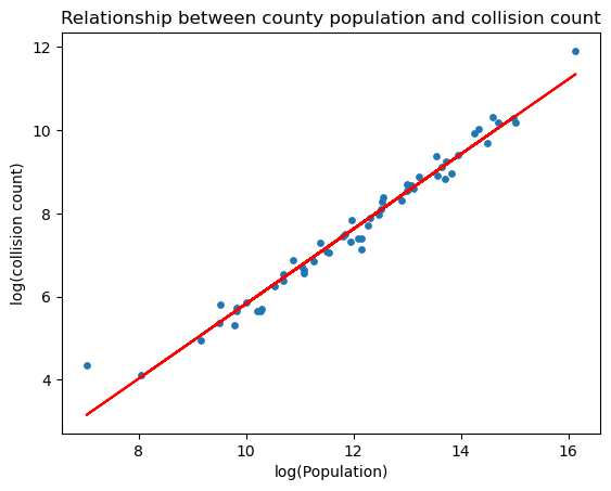
# Take the log transformation of both variables
x = np.log(county_data_2019["Population"])
y = np.log(county_data_2019["Total Crashes"])

# Plot the scatter plot of log(population) vs log(#incidence per 1000 capita)
plt.scatter(x, y, s=15)
plt.ylabel('total')

# Find the best-fit line
a, b = np.polyfit(x, y, 1)
plt.plot(x, a*x+b, color="red")
plt.title("Relationship between county population and collision count")
plt.xlabel("log(Population)")
plt.ylabel("log(collision count)")
plt.savefig(f"{FIGURES_PATH}/scatter3_1.png")
plt.show()
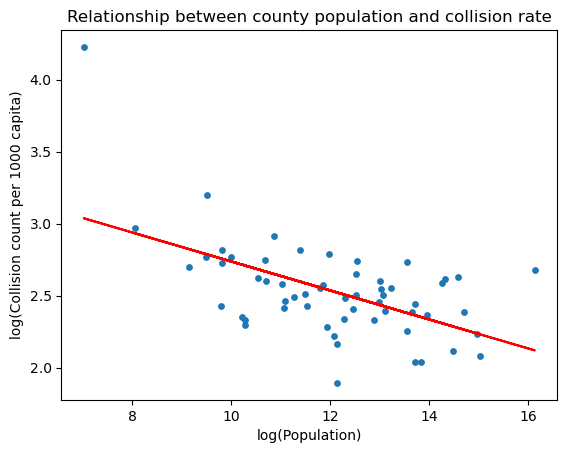
# plot collision frequency (per 1000 capita) by county choroplethmap
county_data_2019["Crashes per 1000 capita"] = county_data_2019["Total Crashes"].astype(int).divide(county_data_2019["Population"].astype(int))*1000
plot_choroplethmap(counties=counties,
                   fips=county_data_2019["fips"],
                   value=county_data_2019["Crashes per 1000 capita"].tolist(),
                   value_min=5,
                   value_max=20,
                   text=county_data_2019["County"].tolist(),
                   title="Collision Count per 1000 Capita by County in California")
# Take the log transformation of both variables
x = np.log(county_data_2019["Population"])
y = np.log(county_data_2019["Crashes per 1000 capita"])

# Plot the scatter plot of log(population) vs log(#incidence per 1000 capita)
plt.scatter(x, y, s=15)
plt.ylabel('total')

# Find the best-fit line
a, b = np.polyfit(x, y, 1)
plt.plot(x, a*x+b, color="red")
plt.title("Relationship between county population and collision rate")
plt.xlabel("log(Population)")
plt.ylabel("log(Collision count per 1000 capita)")
plt.savefig(f"{FIGURES_PATH}/scatter3_2.png")

plt.show()
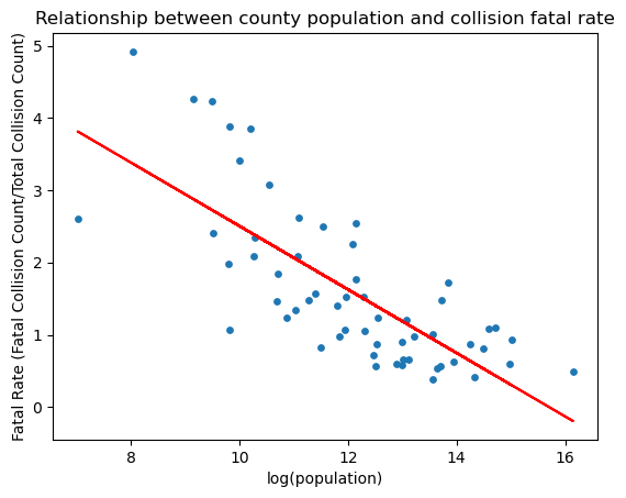
# plot fatal rate by county choroplethmap
county_data_2019["Overall Fatal Rate"] = county_data_2019["Total Fatal"].astype(int).divide(county_data_2019["Total Crashes"].astype(int))*100
plot_choroplethmap(counties=counties,
                   fips=county_data_2019["fips"],
                   value=county_data_2019["Overall Fatal Rate"].tolist(),
                   value_min=0,
                   value_max=3,
                   text=county_data_2019["County"].tolist(),
                   title="Collision Fatal Rate by County in California")
import matplotlib.pyplot as plt

# Take the log transformation of population
x = np.log(county_data_2019["Population"])
y = county_data_2019["Overall Fatal Rate"]

# Plot the scatter plot of log(population) vs Fatal Rate
plt.scatter(x, y, s=15)
plt.ylabel('total')

# Find the best-fit line
a, b = np.polyfit(x, y, 1)
plt.plot(x, a*x+b, color="red")
plt.title("Relationship between county population and collision fatal rate")
plt.xlabel("log(population)")
plt.ylabel("Fatal Rate (Fatal Collision Count/Total Collision Count)")
plt.savefig(f"{FIGURES_PATH}/scatter3_3.png")

plt.show()
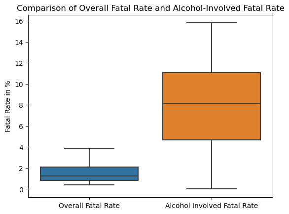
# use barplot to compare the distribution of overall fatal rate and alcohol-involved fatal rate
county_data_2019["Alcohol Involved Fatal Rate"] = county_data_2019["Alcohol Involved Fatal"].divide(county_data_2019["Alcohol Involved Crashes"])*100

sns.boxplot(data=county_data_2019.loc[:, ["Overall Fatal Rate", "Alcohol Involved Fatal Rate"]], showfliers = False).set(
    ylabel='Fatal Rate in %',
    title="Comparison of Overall Fatal Rate and Alcohol-Involved Fatal Rate"
);
plt.savefig(f"{FIGURES_PATH}/boxplot3_4.png")
# Save the dataset for main notebook
county_data_2019.to_csv(f"{DATA_PATH}/county_data_2019.csv")